Salt

Brief
The team of specialists who had previously worked under the Baker Tilly brand has continued its activities outside the international network, providing clients with professional auditing, accounting and consulting services. The challenge was to create a new brand that emphasized extensive experience, high quality standards, and a thoughtful approach to each project.

Decision
The agency's marketers conducted market research, competitors, and category trends, and a positioning was created based on global best practices. Values were formulated - achievement of results, courage, speed, trust. This helped to develop the brand of a company that is determined to "play the long game," challenging circumstances and forming strong relationships with its clients.
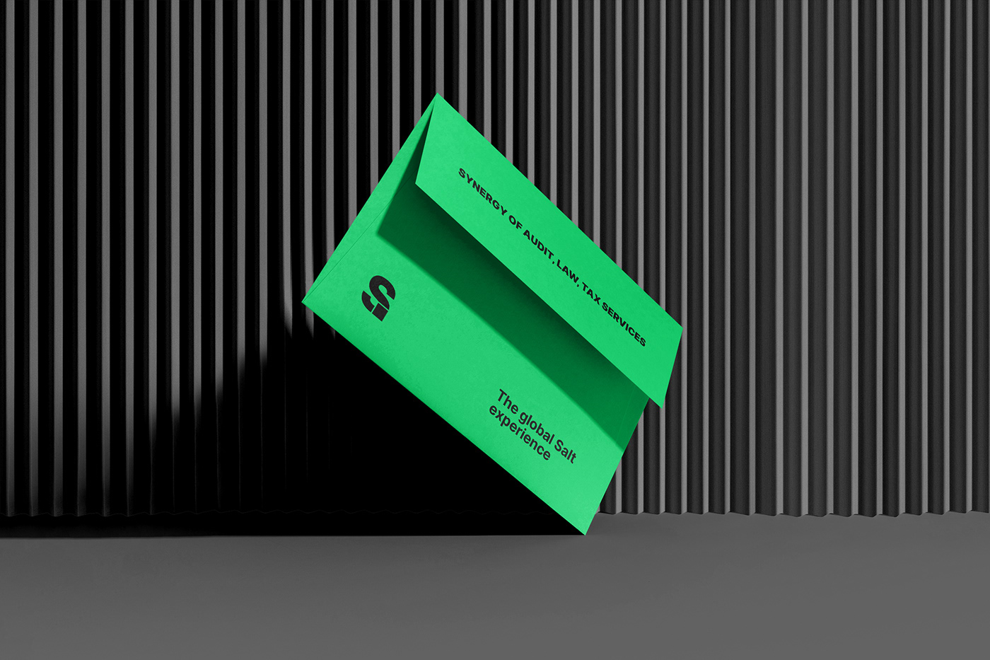
The development of a striking image began with the name Salt. "Salt" is perceived as "the essence" - this meaning refers to the history of the company's emergence. Times change, but the team remains as professional and true to its principles. The name resonates with parts of the words conSULTing and solution, which reinforces associations with services and the mission of the brand. In addition, there are many valuable idioms with the word "salt": "a pud of salt to eat", "salt of the earth", "bread and salt" - they also correspond perfectly with the character of the new brand.
The identity continues to tell the story of thoroughness and sustainability. The massive font of the logo literally supports the stylistic element - a square block. The combination of strict black and bright green colors translates the modernity and scrupulousness of the company's approaches.